Showing posts sorted by relevance for query pastels trend. Sort by date Show all posts

20.3.13

The Pastels Trend

It appears that the pastels trend will continue to grow. We saw this at IMM Cologne 2013 and Maison et Objet 2013, now we see an interesting confirmation- some of the new collectioss that will be launched at Milan Design week this April are also in these colour schemes:


The Haze Series
South Korean designer Wonmin Park has created The Haze Series - a set of furniture made from resin in translucent pastels and Japanese design studio Nendo has created a series of tables featuring pencil shading in pastel colours:

10.12.17

The Colours for 2018 in Interior Design

I am pleased to find that the one colour of the year trend is slowly disappearing. It is obvious that this was quite superficially elected. Yes, it is true that for certain periods we can see an incresed presence of some colour and its hues both - in fashion and interior design, but it is much more realistic to say that we saw for a very long period of time a prefernce for pastel colours everywhere, rather than dominance of a single colour.  And now it is time to enjoy a more bright colour selection that some companies have suggested.

Yet, naming color of the year is obviously a successful business that more and more companies fight to jump on the bandwagon.  "Many of these companies have reported sales increases for products in that specific color as well as across the board. They also report increased traffic to their physical and online stores." writes  DIANA BUDDS in fastcodesign.com - a good analysis that I agree so much with. The article is on the occasion of the announcement of  Ultra Violet, also known as Pantone 18-3838 to be the 2018 colour of the year.  
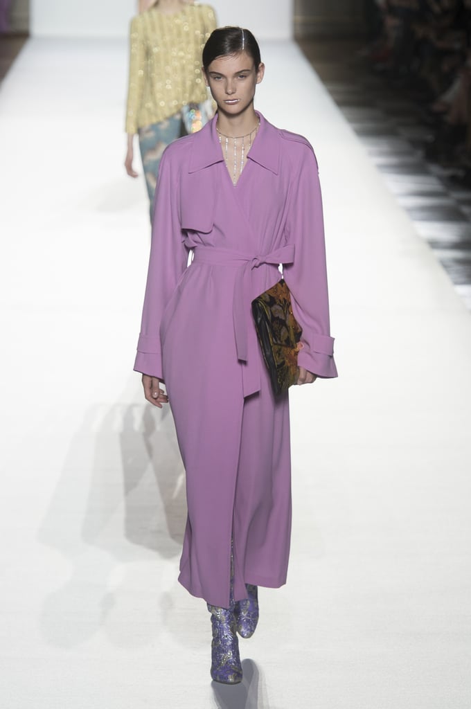
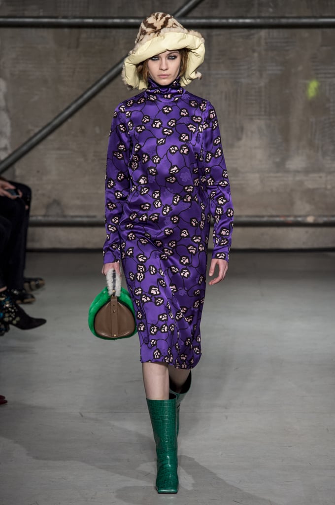
They have their explanation and logic, but any other shade of purple could fit within them, according to me. Anyway, we saw a lot of violet and purple on the runway, too - as always, fashion and interior design have common inspiration:
Dries Van Noten Spring 2018

Image result for Marni, fall 2017Image result for Marni, fall 2017Related image
Marni, fall 2017, Vivetta Fall 2017
But I am pleased to see other inspirational colour choices and combinations offered by other colour companies - we need variety of ideas and freedom of choice.  We saw Caliente - Benjamin Moore’s Color of the Year 2018 for the Home wich is vibrant and fresh, especially as and accent

Benjamin Moore Color of the Year 2018: Caliente AF-290-design addict mom
source: dezeen


and we saw what Sherwin Williams chose for 2018 - Oceanside:

A colour that leads us far away from the Pastels trend from the last several years, but the choices of Dulux - Heart Wood:


Heart Wood се комбинира чудесно с топлия шоколадово кафяв цвят.

and  Behr - In The Moment are also in the pastels group:
In the Moment - Behr za 2018


But  Behr offers also a 2018 Trend palette along with our 2018 Color of the YearAll Color Samples

We are going to see even more colour ideas at the coming international design events in January - so stay tuned, I am going to publish soon a post about Trends in Interior Design for 2018, and feel free to express yourself without limitating to one colour and its hues :)

12.10.17

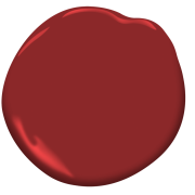
Benjamin Moore’s Color of the Year 2018 is Caliente AF-290

In the last couple of years the choice of colour of the year has become an interesting theme in the world of design and fashion, but we are seeing many companies doing it and with different choices, of course. It happened also that they chose several colours or a palette of colours, which, according to me, could be good, if they were not so numerous :) So, now I am glad to share the single Colour of the year 2018 announced by Benjamin Moore - a beautiful red named Caliente AF-290:
"NOSTALGIA gives way to fresh, energetic hues..."
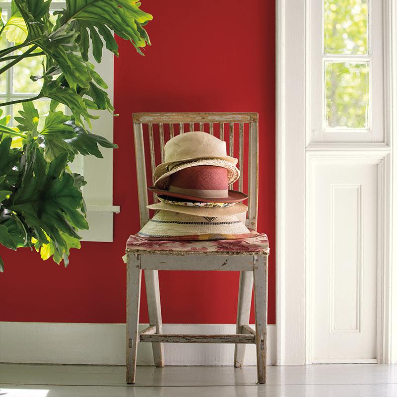
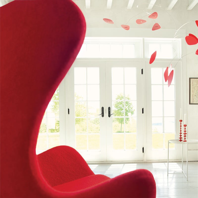
"Caliente is the signature color of a modern architectural masterpiece; a lush carpet rolled out for a grand arrival; the assured backdrop for a book-lined library; a powerful first impression on a glossy front door. The eye can’t help but follow its bold strokes. Harness the vitality.” 
—Ellen O'Neill, Benjamin Moore & Co.

A pile of well-worn sunhats sits on a wooden chair against a red hallway wall next to an open front door.

A red tulip chair faces a white room featuring a red mobile and French doors with views to greenery outside.

How do you like it?

What do you think of these so many trending shades for 2018? If you have not read about the other trending colours, read this article by Domino. What I consider worth following is a more general trend in interior design - like the pastels trend or the coppper trend, because they give you a more real information about what will be trending in the coming years. These are stable trends that have formed the design scene of the world for several years and for a very good reason - check my posts to see why.

23.4.13

Interior design trends 2013


There are several distinct trends in interior design and decorating that seem to gain popularity this year:
- pastels - pastel colours stood out and showed up in the new spring collections of many home furniture and accessories brand during all the major design events this year - IMM Cologne and Maison&Objet in January and Milan Furniture Fair this month. And that is for a reason - pastels bring the calm and happy atmosphere in our homes that we are all looking for.


Truhe Maharani

Maharani chest

- stripes - as we know, fashion and interior design have a lot in common. Trends from fashion world soon appear in our homes. We are seeing a lot of stripes on catwalks this spring, so expect them to become the new fashion for your home, too, very soon.
Penelope White Kissenhülle von Greengate

Penelope White cushion

Philosophy by Alberta Ferretti
Iittala - Origo Schale 0.15 l, orange
Origo dinnerware for the Finnish manufacturer Iittala. 

- copper was one of the big themes during Milan design week 2013 and probably will continue to be in fashion for long;
- reclaimed wood: recycling, re-purposing and reusing old furniture and home decor accessories will continue to be a hot trend in interior design this year, too. And this is not just a fashionable trend. Due to its seasoned and air-dried nature reclaimed wood is a prefered material which, unlike the generic MDF or plastic alternatives, makes each piece of solid reclaimed wood furniture unique. 
PARADISO Kommode mit 4 Schubladen

PARADISO Kommode

- vintage mood and retro furniture:
Hocker antique von Bloomingville
Antique stool  from Bloomingville

Thekenmöbel Flore
 Flore

And finally one trend that I like very much - blurring the boundaries between indoors and the garden/patio is absolutely a booming trend for the last couple of years. With the summer just a few weeks away it is the right time to think of your outdoor retreat, even if this is just your balcony. With the proper home furniture and accessories it is not difficult to transfer the vacation atmosphere at home. 

19.4.13

In search for tranquility - the pastel trend at Milan Design Week 2013

 "Ro", which means tranquility in Danish, is the name of the latest creation of Spanish designer Jaime Hayon for Republic of Fritz Hansen, unveiled this week in Milan. This new easy chair is available in nine colours, which, as you can see, are mostly pastels:

More examples of the pastels trend at Milan 2013 :scholten & baijings: colour porcelain - designs of the year 2013 shortlist
Colour Porcelain by Scholton Baijings
 Colour Porcelain by Scholten & Baijings 
As we saw earlier in pastel shades are also the Lu tables by Yuhang Porcelain,  Maarten De Ceulaer's "The Chest Of Suitcases", The Haze Series by Wonmin Park and studio Nendo's series of tables.

4.12.16

Interview with TrendOffice on Floor Coverings International

I am happy to share that I, as owner of Trendoffice Interior design Consulting, was asked to answer several questions by Floor Coverings International about design in general and trends in design. I think that my readers will find it interesting to read the Interview with TrendOffice on their blog. Here below is the beginning:

"At Floor Coverings International Ottawa East, we love to inspire and inform. We know that a secret to a beautiful home is more than amazing flooring. That’s why we introduced our Designer Influencer Interview Series, to give you a peek at the latest trends in home design. Our latest interview features talented designer and blogger Temenouzhka Zaharieva of TrendOffice. You can follow Temenouzhka on Facebook.

What’s one of your favorite design pieces you have in your own home?

‘Design pieces’ is quite vaguely defined term – I always try to buy everything with good design. Most of the furniture at home is designed by me – part of the kitchen, dining room, some of the furniture in the living room, bedroom and children room, our walk-in cupboard, my desk. But if we talk about famous designers’ work, most of it is not readily accessible and that is the problem nowadays – we would like to have good design everywhere around us, but how many families can afford pieces by Urquiola or Marcel Wanders? Or the famous designer furniture by modern classics from the last century? Yes, we do have the beautiful Eames Molded Plastic Side Chairs with Eiffel Tower Base at home – the most popular designs from that period, but they are also some of the most widely imitated. Fakes are everywhere and people are forced to buy fakes just to be able to enjoy the idea of good design, using bad quality furniture. Good design should be more accessible.

What is your favorite design trend of 2016?

I am happy to find that pastels are still on trend no matter that Pantone and other colour companies are no more choosing one Colour of The Year, but sets of themes and colours. Still, pastels are part of them. And that is quite natural – we need the calmness they supply to our environment. And another staying trend that is my favorite – copper and copper hues. They are so warm and cozy. Based on my experience, I have my own prediction for a favorite Colour of The Year 2017. By following all the new products and events in the field of interior design, I think that we shall continue to see a direct connection between fashion and interior design and yellow will be a very popular colour next year...."
Thank you, Jordan, it is good to be able to share thoughts and ideas with your readers.
B&B
Read my earlier blog posts if you want to read about my expectations about Trends 2017.

9.7.15

Romantic pastels

and great product design properly coordinated in one interior - all that is united in just one photo:
source
The pastels trend does not want to go! But I was so much attracted by this photo, because of its perfect setting. In fact that is what interiors designer do - provide you with the mood, feeling of well-being and comfort in everything that surrounds you!
Looking at the simple and uncluttered design you may say it is easy, but in order to create this set, one has to be well-acquainted with terms like form, balance, harmony and know how to use these. Then, knowing the work of good designers one can choose properly the suitable elements to create one perfect set and apply it on a preliminarly perfectly designed 'shell'. 
Long years of professional experience and 'designers eye for good design' help a lot, too ;)

23.9.13

Complete overlap between trends in fashion and interior design


at least what concerns colours, as we can see from the ELLE's New York Fashion Week trend reports:

- black and white is proving its staying power:

Ralph Lauren Spring 2014 Ready-to-Wear Collection
and GRAPHIC
                                  Diane von Furstenberg Spring 2014 Ready-to-Wear Collection
- pastels:

Tory Burch Spring 2014 Ready-to-Wear Collection
- metallics:
Gucci Kim Metallic Leather Lace-Up Bootie

Diane von Furstenberg Spring 2014 Ready-to-Wear Collection

And in interior design:
Pastels are a major trend in interior design since the beginning of the year, as we have seen from the first design events and untill the latest ones:
Article Image

Image via Pinterest

Copper Inspiration from Tom Dixon


The same allplies for Graphic design and metallics, too,
 but more posts on the theme will follow soon.

2.10.16

Pastels again - that is the trend for 2017

Or at least - one of them. Each colour company now is publishing their trend predictions for the coming year. Today I saw what Behr's color experts are saying:
Keeping the main living area of your home fresh and modern is easier than ever with the BEHR 2017 Color Trends as your design inspiration. You’ll simply love the look of this paint combination of Gold Hearted, Close Knit, Everything Rosy’s, and Midnight Show.:

Comfortable Palette

"The Comfortable colors are
muted pastels, evolving away
from sweet and bright colors.
They feel feminine and
sophisticated, especially when
paired with light, natural tones."

Capturing the eclectic, modern aesthetic you love is easier than ever, thanks to this paint combination. Refresh your home’s dining room with BEHR’s new 2017 Color Trends and try a geometric pattern on the floor for a unique look. Featured colors | Close Knit, Polished Aqua, Wanderlust, and Jade Dragon.:

Composed Statement


But also 


The Confident palette from the BEHR 2017 Color Trends embodies all that is fun about color - it is adventurous and takes some risks. These colors are perfect for places you want to add a drama point - an accent wall, the back of a door, or in the kitchen. | Featured colors: Jade Dragon, Shades On, Hot and Spicy, and Lemon Burst.:
source

"The Confident palette
embodies all that is fun about
color - it is adventurous and
takes some risks. These colors
are perfect for places you want
to add a drama point - an
accent wall, the back of a door,
a piece of furniture..."

Confident Outlook

and 

Confident Nature

I like this approach - what about you?


1.7.13

Pastel inspirations for your home


We have spotted the raising of the pastels trends in earlier blog posts here and in my Clippings post, but I came accross today at some really beautiful illustrations of this trend in interior design projects:


They are by set designer and design consultant Laura Fulmine and I found them on The Design Chaser.
Here below are some more inspirations from this blog - really nice colour combinations, that show exactly this calmness pastels exude.
 - an example how pastels can be applied on the wall. Inspiration for wall colours can come from some furniture pieces:

Prince AHA Stool Prince AHA Stool  a seat or a table, available in a myriad of pastel colors, this stool is crafted to withstand the elements in a garden or on a deck.
Or other decoration like textile
BambooWeave Ribbed Towels
or ceramics:

Garden Seaglass Triangle Plates Garden Seaglass Triangle Plates
One of my favorite home decor elements is glass - it brings instantly beauty and inspiration in your room. Just have a look at these calm aqua and green tones in unusual forms: Aqua and Citrine Balloon Vases Aqua and Citrine Balloon Vases